arXtect
A design-to-code renovation — bridging brand identity and frontend delivery for an AI-powered LaTeX editor built for researchers.
arXtect is a next-generation LaTeX editor powered by AI and WebAssembly, built to solve the slow compilation speeds of tools like Overleaf. The technology was compelling — but the branding wasn't keeping up. Dense, technical, and hard to approach, the product's initial identity failed to communicate its core value: simplicity and speed for researchers.
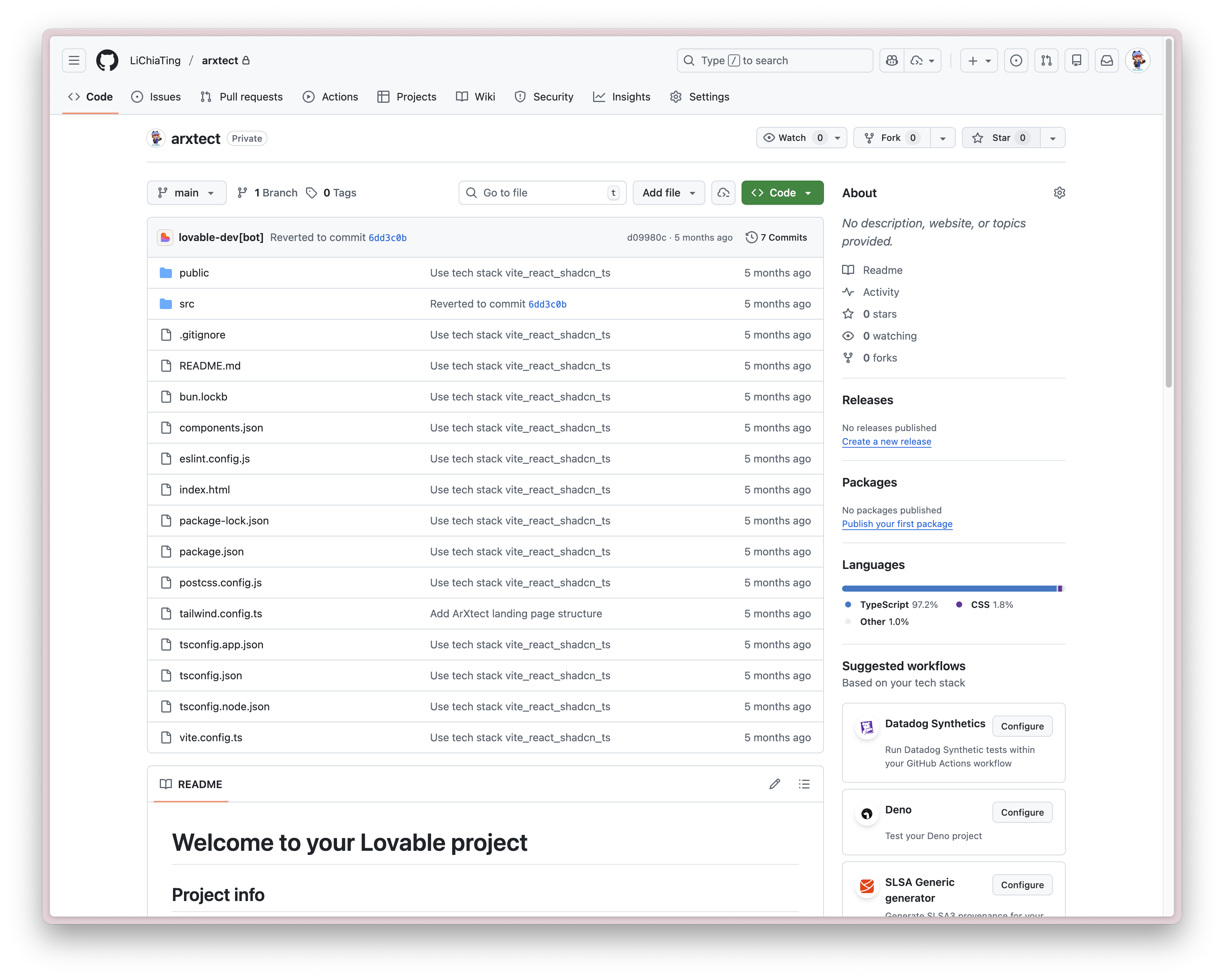
Dianne stepped in to bridge a gap the core engineering team didn't have bandwidth to cross. Rather than producing static mockups and handing off redlines, she adopted a "Design-as-Code" workflow — architecting the responsive landing page in Base44 and committing production-ready code directly to the team's GitHub repository. One designer. Zero translation layer. Clean launch.
LaTeX is notorious for its learning curve. arXtect's strength was removing that friction — but its branding told a different story. The existing site leaned into syntax-heavy aesthetics typical of academic tools: dense layouts, abstract diagrams, and feature-first copy that buried the actual benefit.
At the same time, the engineering team was deep in optimising the real-time compilation engine. They needed a polished frontend — but they didn't have cycles to build one.
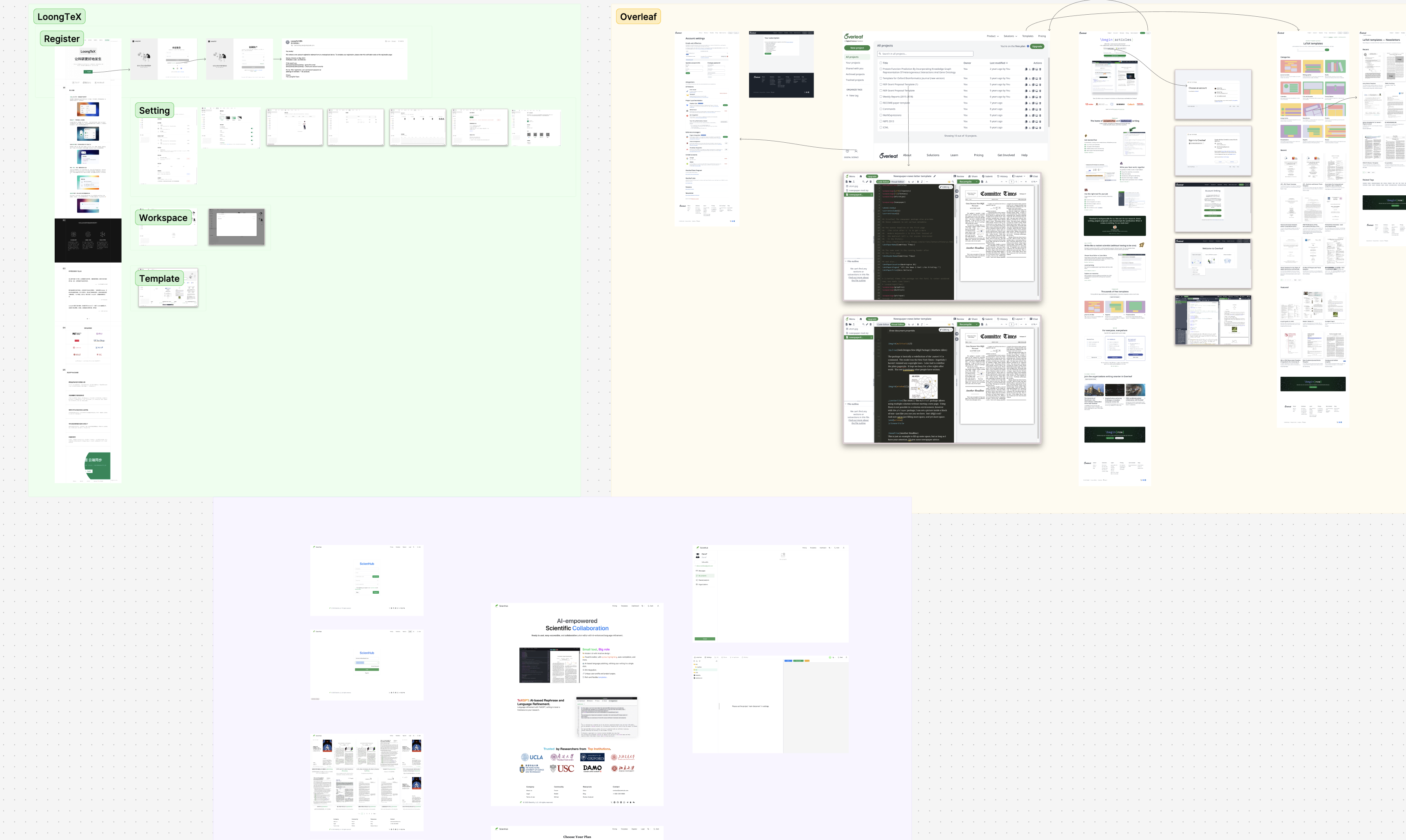
Before opening Figma, Dianne spent a day mapping the landscape. The founder shared the existing site alongside key competitors — primarily Overleaf and LivingText. Rather than jumping straight to visual references, she screenshotted and annotated each product to identify the patterns they shared and the gaps arXtect could own.
The analysis surfaced a consistent pattern: tools in this space defaulted to dense, feature-heavy layouts that treated researchers like developers. The opportunity was clear — position arXtect not as another code editor, but as an intelligent writing environment. That shift informed every subsequent design decision, from copy hierarchy to colour system.
Traditional design handoffs — redlines, spec sheets, translation meetings — cost time teams don't have. Dianne bypassed the standard process entirely.
She architected the responsive landing page logic directly in Base44, then committed production-ready frontend code to the team's GitHub repository. The engineering team's role was simple: pull and build. No reinterpretation. No implementation gaps. 100% design fidelity with zero engineering overhead on their side.
The Base44 prototype is the actual deliverable — both the landing page and editor interface, built and handed off directly. The live product at arxtect.cn is what the team shipped from it.
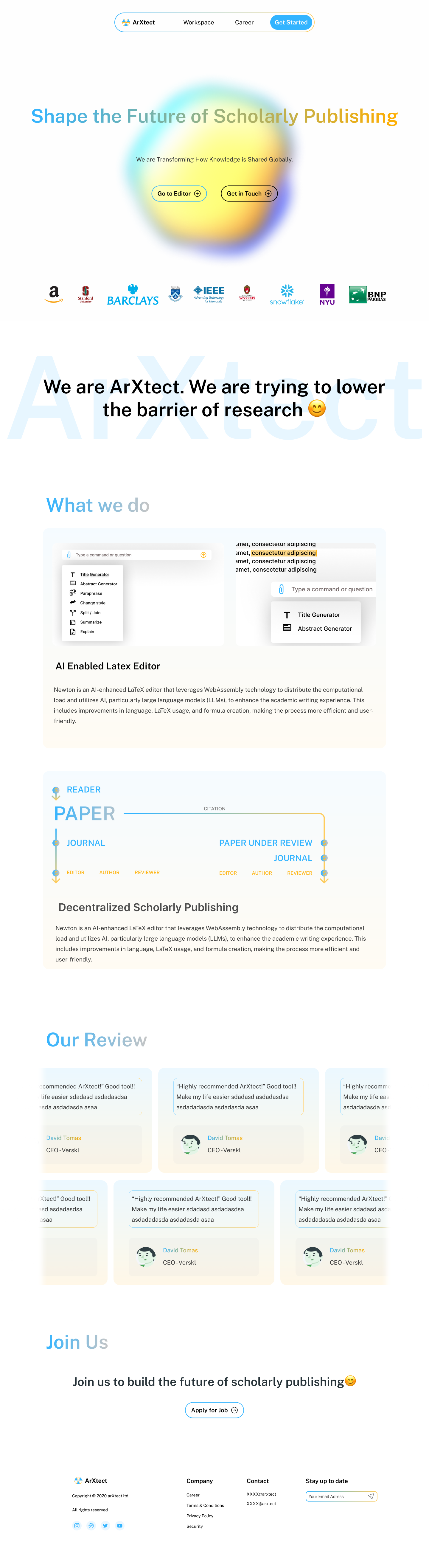
LaTeX is powerful but intimidating. The design strategy was "visual de-noising" — not hiding the complexity, but removing everything that made the product feel harder than it was.
Two specific decisions drove this. First, the abstract diagrams and dense academic-style backgrounds were removed entirely — replaced with a clean grid, generous whitespace, and block-based layouts that let the content breathe. Second, the navigation hierarchy was simplified so researchers understand what the product does within the first scroll, without reading a manual.
The goal was to reframe arXtect not as a coding environment, but as an intelligent writing assistant that gets out of the researcher's way.
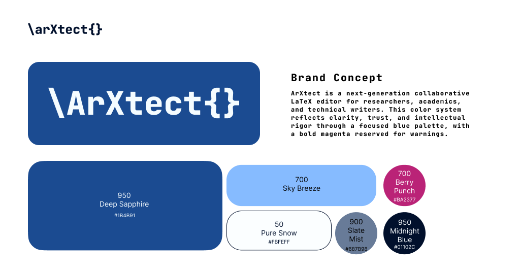
Brand Colour System
The logo takes the "X" from LaTeX — the symbol every researcher recognises — and strips away the typeset formality to make it modern and product-ready. Familiar enough to signal domain fluency; clean enough to stand alone as a brand mark.
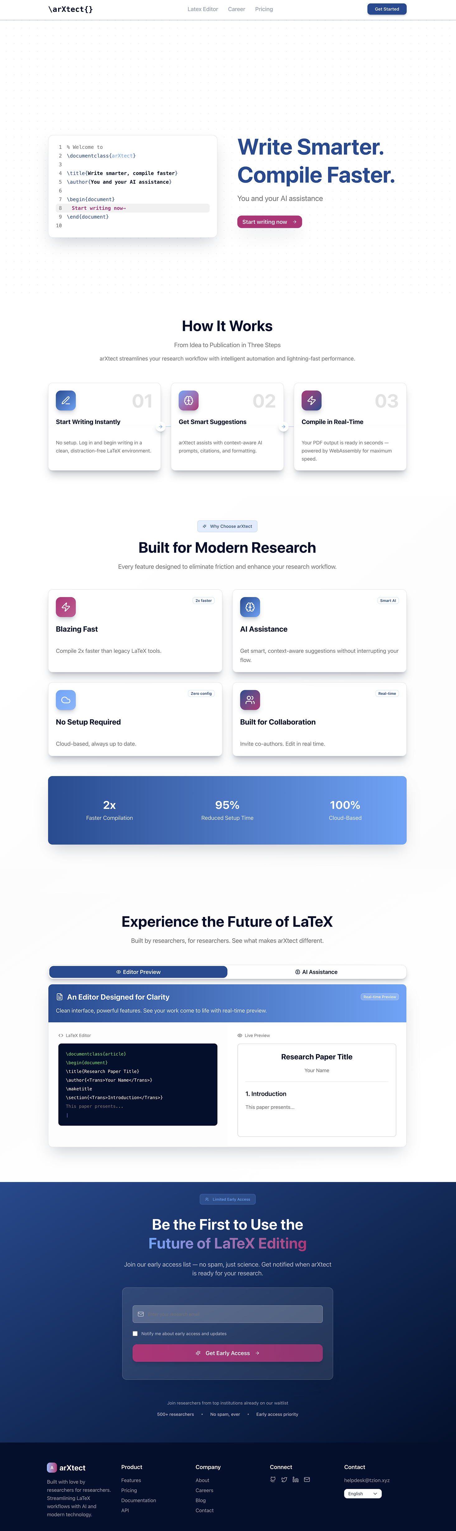
The editor interface itself also received a full design pass — restructuring the workspace layout, component hierarchy, and interaction patterns for the writing environment researchers use every day.
Watch the editor design walkthrough →The original site buried the product's value under technical specifications. Dianne led a content audit to flip the hierarchy — from features to workflow, from backend capabilities to researcher outcomes.
The competitive research from the first day surfaced a consistent pattern across Overleaf and LivingText: both tools defaulted to feature-first copy that treated researchers like developers. The revised copy for arXtect centred on three tangible benefits: 2× Faster Compilation, Zero Config Setup, and Context-Aware AI Assistance. Each spoke directly to the friction researchers experience with legacy tools — and positioned arXtect as the obvious next step.
The content hierarchy decision was deliberate: lead with the outcome, follow with the proof. Visitors understand why they should switch within the first scroll — not after reading a whitepaper. That's the same shift the visual de-noising achieved in the interface: from "impressive to engineers" to "useful to researchers."
arXtect launched with a cohesive brand identity — from logo to software interface — and a production-ready marketing site that communicates its value proposition without asking engineers to context-switch. The Design-as-Code workflow eliminated the translation gap entirely: what Dianne designed was exactly what shipped. The design system built during the sprint gives the team a foundation to build on as the product matures.