MoodBoard
Upload a photo of your room, set a budget, tap a few style tiles — and get your actual space transformed, with a real, shoppable product list sourced live from the web. Built in 17 hours, as a team of four.
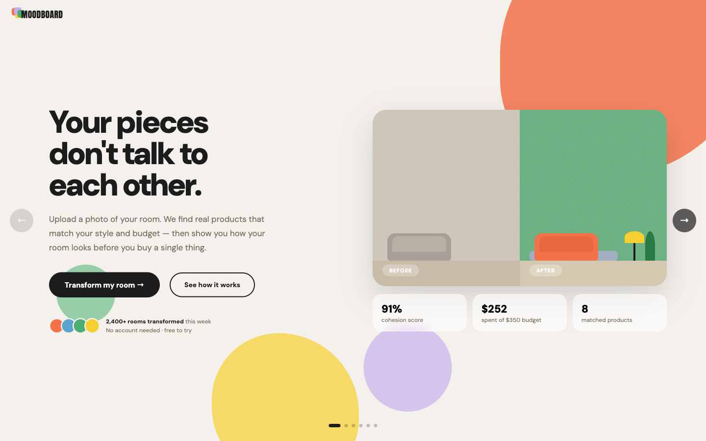
Finding furniture that actually fits — your space, your style, your budget — means hours lost in an ocean of online options. And the tools that promise to help either ignore the budget, or leave you with a pretty picture and no way to actually buy.
We’re all renters — so this was a pain we’d each lived, not one we imagined. Whether you’re filling an empty room from scratch or working around furniture you already own, it breaks at three distinct points. MoodBoard was built to close all three at once.
IKEA alone carries thousands of products; Wayfair, millions. Without a visual direction, every choice feels like it could be wrong — so people impulse-buy or stall.
Existing tools render a redesigned room. None search for actual purchasable products that fit a real budget. The gap between inspiration and action stays exactly where it was.
People who furnished piece by piece end up with rooms that feel random — not bad taste, just each purchase made in isolation. The room has no thread.
MoodBoard searches the web in real time for products that match the user’s style and budget, composites them into a photo of their actual room, and delivers a prioritised shopping list they can act on immediately.
The idea was locked at 8pm. The venue closed at 10pm. Those two hours went to research — first a fast scan of existing tools to pin down the gap (they render a pretty room, but none shop it to a real budget), then the real depth into the people. Three personas, built around the users who actually redecorate on a real budget.
Different situations, different stakes — but one shared problem: not a lack of taste, but too much noise. All three needed the field narrowed, fast, to things that would actually work together in their specific space.
- Make the room feel cohesive — pieces that belong together
- A saved plan to shop from gradually, not all at once
- Discover taste by seeing it, not describing it
- Bought pieces separately — the room feels random
- Can’t translate Pinterest into a real decision
- Loses track of spend across shopping sessions
- A starting kit — the essential 6–10 pieces
- Commit to a style they won’t regret in 6 months
- A clear spend order — what to buy first
- Blank-canvas paralysis — nothing to anchor from
- Fear of style regret — can’t commit unseen
- Urgency + overwhelm — buying fast = random room
- Look intentional and curated — not budget
- Pieces under $30 — IKEA, thrift, or dupes
- A shareable “room makeover” moment
- Tools always recommend things out of budget
- Style exists, execution doesn’t — can’t afford it
- Feels excluded — “this tool isn’t for me”
That finding anchored every subsequent decision: no open text inputs. Every choice had to be visual, bounded, and immediately actionable.
As a team, we first talked through the flow and pulled out the screens we’d need and what each one had to do. From there, I used the personas and this map to pin down the emotion at every step in detail — and made it my guide for the design that followed. Every later decision — budget-first, the named loading screen, the composited “your actual room” reveal — traces back to a stage on this map.
Most AI design tools cluster around two visual modes: clean SaaS grey, or professional-grade dark-mode tools dense with controls. Both say the same thing implicitly — this tool is for people who already know what they’re doing.
The persona research had made the target user clear: someone overwhelmed by too many choices, not someone who needed more professional controls. So the direction landed deliberately opposite — warm, encouraging, a little playful. I named the system Warm Studio.
The interface should feel like a knowledgeable friend, not an interior design tool.
The next morning, before a single screen was designed, I built the design system. In a team of four under time pressure, a design system isn’t optional — it’s the communication layer. With it, the rules are already made and engineers can move in parallel without waiting on design.
Cream backgrounds instead of white. Heavy DM Sans — bold enough to feel confident, rounded enough to stay approachable. Organic colour blobs used sparingly: personality, not decoration.
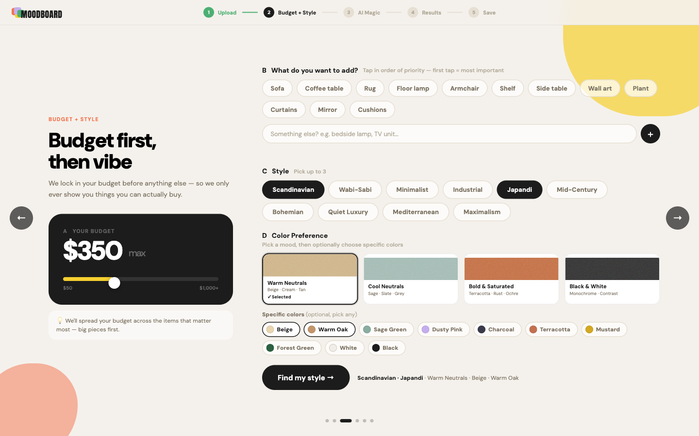
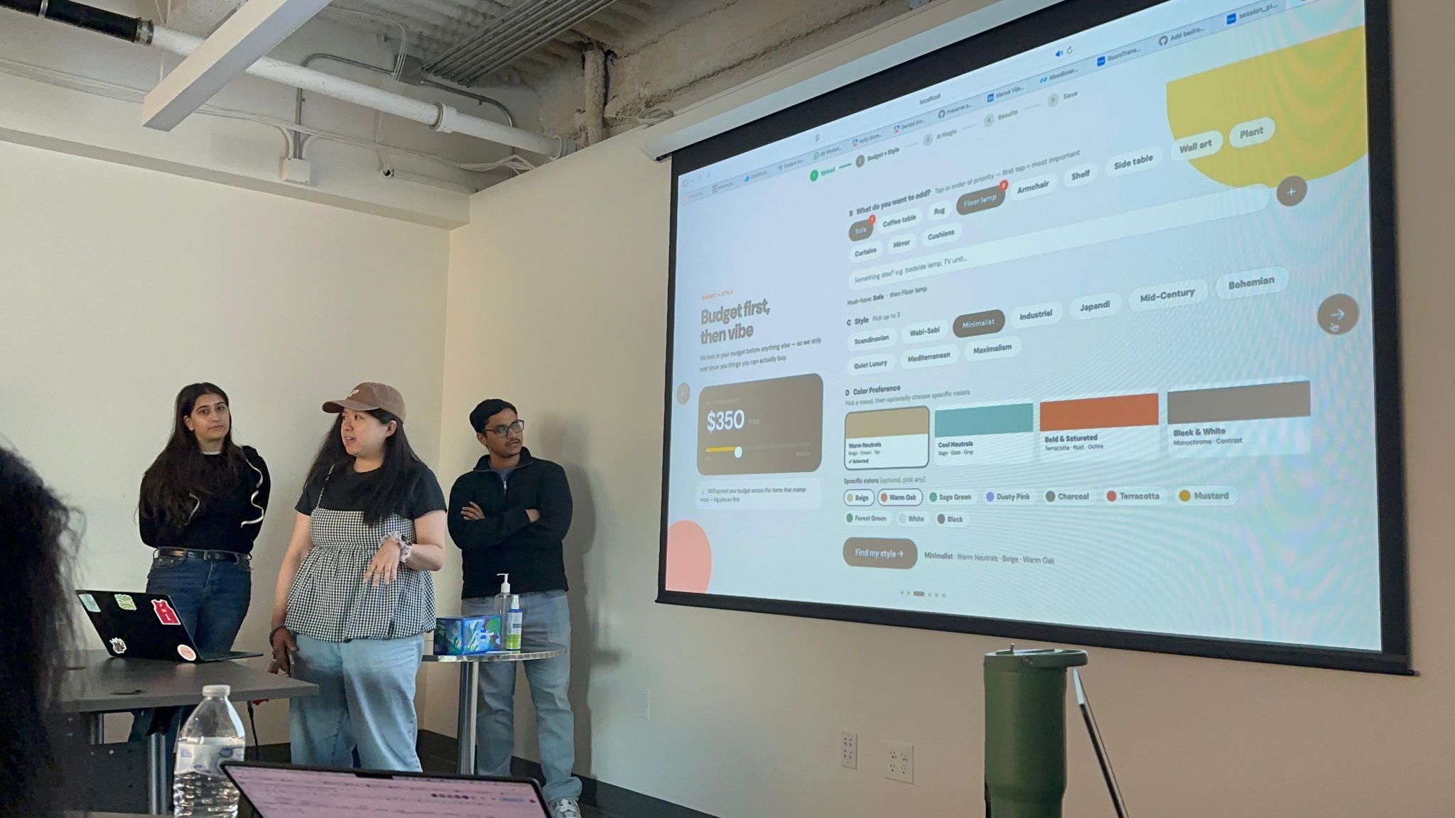
The sharpest call in the system wasn’t a colour or a typeface — it was the sequence of inputs on the Budget + Style screen.
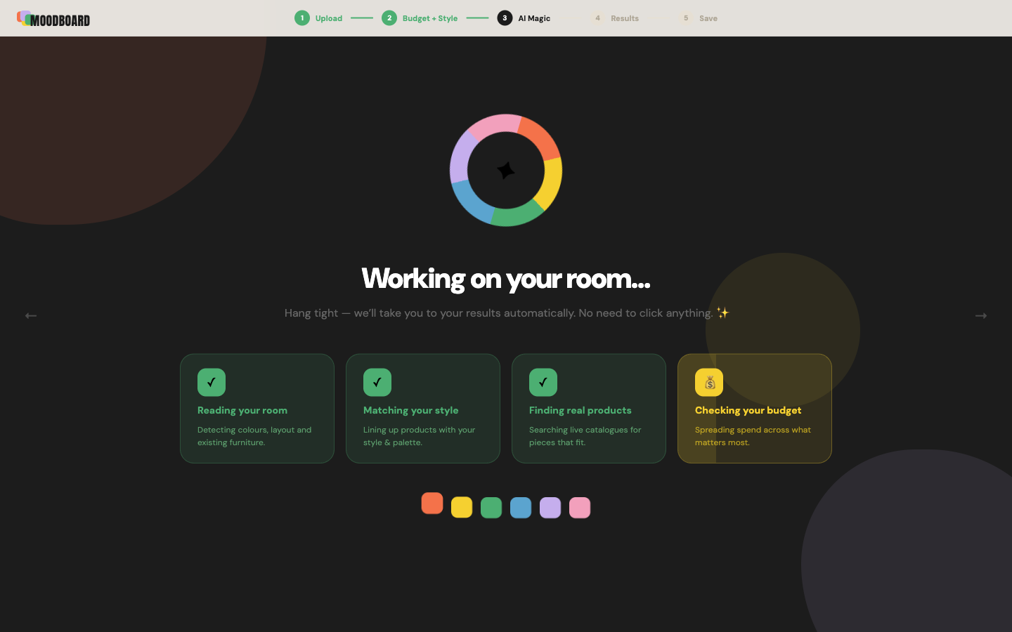
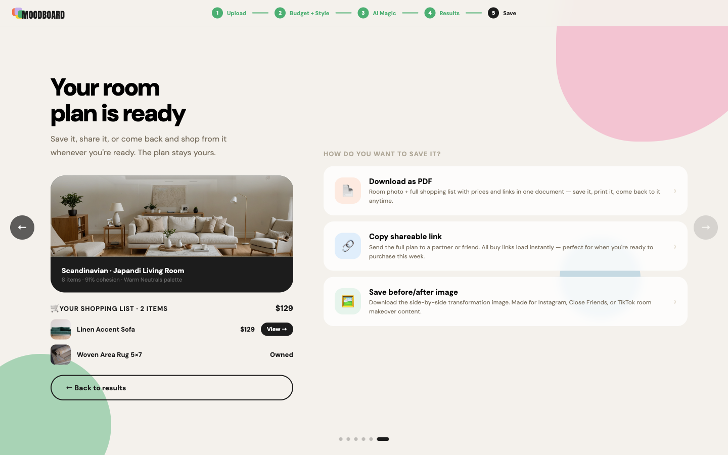
Six screens, each with a single primary action, each mapped to a moment in the journey: Landing → Upload → Budget + Style → Generating → Results → Save.
Here the process leaned on AI as an accelerator. Once the design system was set, I had Claude regenerate the wireframes in the Warm Studio direction — turning a low-fi layout into a hi-fi screen I could actually react to. I used that hi-fi version to lock direction with the team, then fed it back to Claude to generate the React code. That working frontend went straight to the shared repo, where my teammates wired up the backend. No redlines, no spec document — the running code was the handoff.
Below are all six screens, captured live from the shipped product.
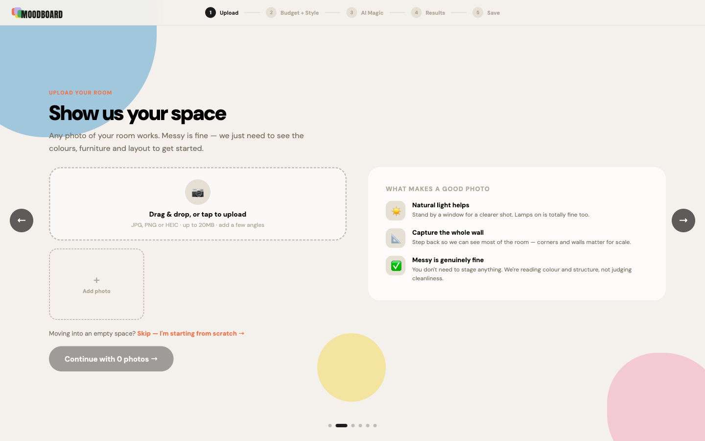
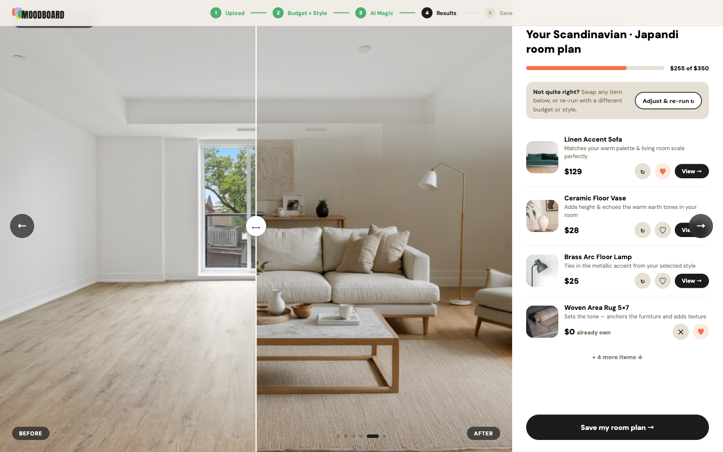
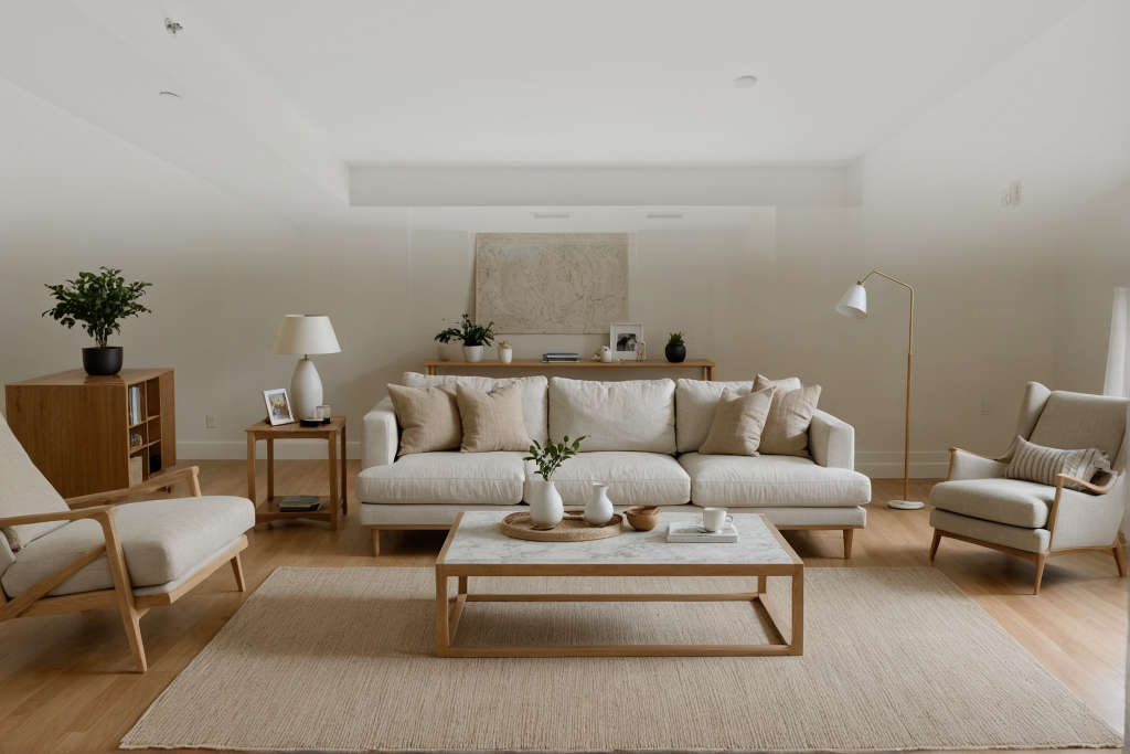
The moment the product either delivers its promise or doesn’t: the user’s real room, with new pieces placed in it — every item sourced live and priced to a $350 budget.
At 1pm on May 30th, the team submitted a working product. The Apify-powered product search worked. The room photo composite worked. All six screens ran end-to-end. What got cut: the mobile version and the landing page — both planned, both dropped when it became clear there was only time for the core flow. A product that does one thing well beats a polished one you can’t demo.
Two skills sharpened under pressure. First, design-direction speed — reading a space of reference images quickly and locking the right visual language without circling back. Second, collaborating with engineers through code — not handing off specs, but pushing working React to a shared repo and fixing issues in real time alongside people building the backend. That kind of collaboration only happens under a deadline.
The hackathon required every team to use sponsor tools — and in our case, the sponsors became the product. Four services, four jobs.
Reads the uploaded room photo — detecting existing furniture, colours, and layout.
Scrapes the live web in real time for purchasable products that match style and budget. No fixed database — real results.
Curates the scraped candidates, writes the “why this fits” reason on each card, and generates the moodboard PDF.
Stores session photos and returns the finished PDF as a shareable download link.
The frontend — my piece of the stack.
One thing the architecture made clear for the design: the Generating screen couldn’t be a generic spinner. The pipeline is genuinely multi-step — room analysis, web scraping, AI curation, PDF render. The loading screen shows each step by name (“Reading your room… Searching the web… Finding products…”) because the wait needed to feel purposeful, not broken. The wait is the feature.
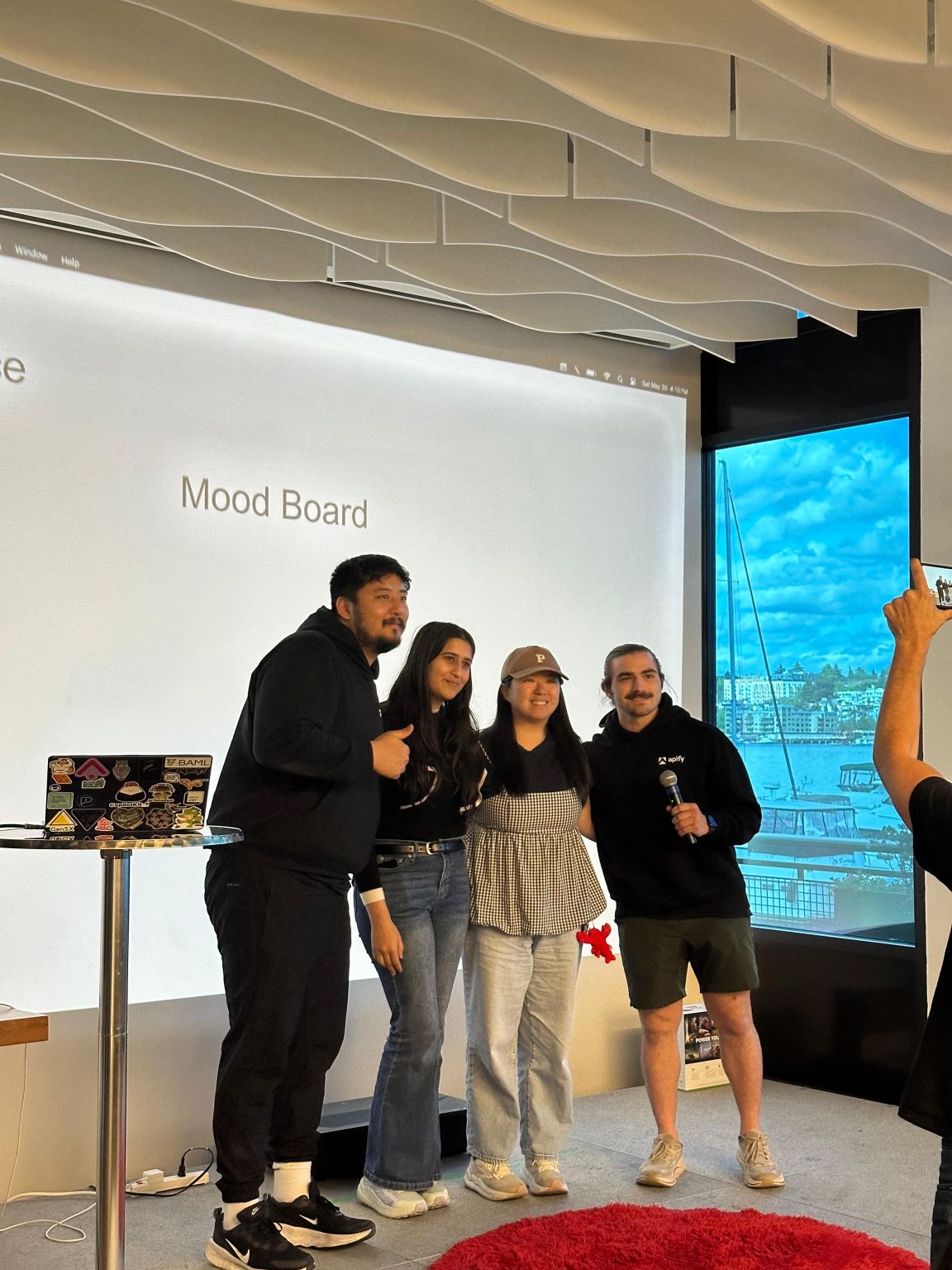
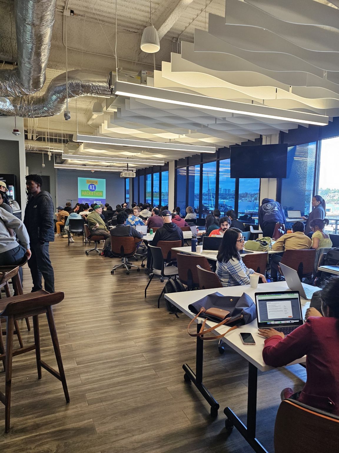
17 hours, four people, thinkspace Seattle — from idea-lock at 8pm to a working product on stage.
Four people, four clear ownerships — design, room generation, AI curation, and the data layer. Each owned their slice end-to-end.
Owned design and frontend — ran the UX research, built the Warm Studio design system (tokens, type, components), and shipped the React upload → style → budget → result flow.
Owned the room-generation backend — a Spring Boot service on AWS Bedrock (Stability inpaint) that paints furniture into the photo, with a gradient mask so the original walls and ceiling blend into the result.
Owned the AI product curator — wired Apify’s Amazon & IKEA scrapers into Claude to recommend budget-aware products that match the user’s style and work together as a room.
Owned the Box data layer — handled photo uploads and per-session folders, persisting each room photo and its generated result to Box storage.
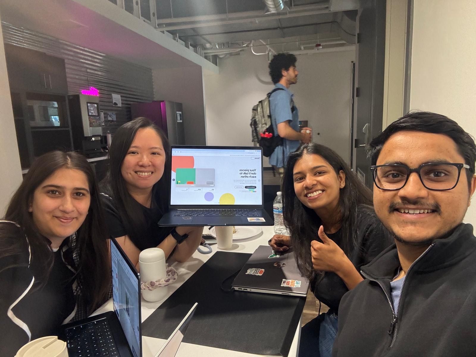
Top 12 of 54 teams, and 1st place in the Apify Prize category — $500 — at Cascadia AI Hackathon 2026. For most of us, it was our first hackathon.